11 Wall Decor Mistakes That Make Your Home Look Cheap (And How to Fix Them)
July 10, 2026 · Lilac Pearls
Learn the wall decor mistakes quietly making your home look cheap — from hanging height to scale, plus simple, budget-friendly fixes for each one.
Disclosure: Some links in this post are affiliate links, which means I may earn a commission at no extra cost to you.Thanks for you support.
Your walls make up the largest surface area in any room, so they set the tone before your furniture ever gets noticed. If a space feels "off" even though you've invested in good pieces, the walls are often the reason why. The good news is that most wall decor mistakes have nothing to do with budget, they come down to placement, scale, and a little intention.
Below are 11 of the most common wall decor mistakes that quietly make a home look cheaper than it is, along with simple ways to fix each one.
1. Hanging Art Too High
This is the single most common wall decor mistake, and it happens because people instinctively hang art near the ceiling to "fill space." The result is usually an awkward gap between your furniture and the artwork above it.
The fix: The center of your artwork should sit at roughly eye level, about 57–60 inches from the floor. Above furniture, leave 6–10 inches between the top of the piece and the bottom of the frame so the two feel connected instead of floating apart.
2. Choosing Art That's the Wrong Scale
A small picture above a large sofa can look lost, while a narrow piece above a wide console can feel disconnected from the furniture beneath it. Scale is something people feel before they consciously notice it.
The fix: Artwork above a sofa, bed, or console should span roughly two-thirds the width of the furniture. If one piece feels too small, consider a larger single artwork or a grouped arrangement instead.
wall art scale sofa guide
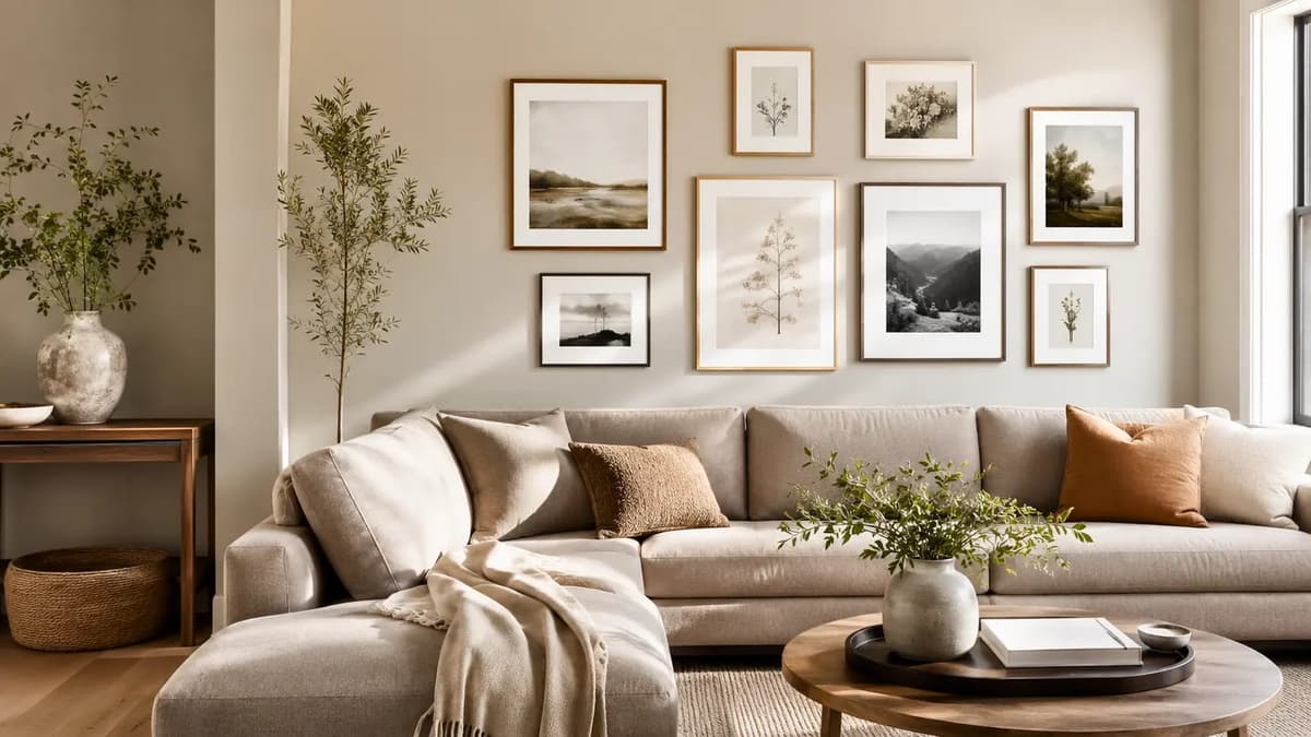
3. Scattering a Gallery Wall Without Alignment
Random spacing and mismatched heights turn a gallery wall into visual noise instead of a curated feature. Tiny frames scattered across a large wall are one of the fastest ways to make a space feel unfinished.
The fix: Pick one alignment method that may be top edges, center line, or bottom edges and stick to it. Keep spacing between frames consistent, around 2–3 inches, and lay the arrangement out on the floor (or trace it on paper) before you pick up a hammer.
4. Mixing Frames With No Cohesion
Grabbing whatever frames you already own can leave a wall feeling thrown together rather than styled. Cheap-looking wall decor is often less about the art itself and more about mismatched, low-quality framing.
The fix: You don't need matching frames, but you do need a common thread, the same finish, the same color family, or the same frame width throughout the arrangement. Upgrading basic prints into solid frames is one of the fastest, most affordable style upgrades a wall can get.
5. Overcrowding the Wall
More isn't always better. Too many small pieces competing for attention makes a wall feel cluttered instead of curated, especially when there's no breathing room between them.
The fix: Choose one focal point per wall. If you love a maximalist look, group pieces intentionally within a defined boundary rather than letting them spread randomly across the whole wall.
curated wall gallery spacing
6. Leaving Walls Completely Bare
The bare walls can make a home feel temporary, like you haven't quite settled in yet. This is especially common in newer homes or rentals where decorating feels like a big commitment.
The fix: You don't need to fill every wall. Start with the ones you see most, may be above the sofa, along a hallway, or behind a bed and build from there. Even one well-placed piece changes how finished a room feels.
7. Buying a Matching Wall Art Set From One Collection
Grabbing a pre-packaged set of three matching canvases feels like an easy shortcut, but it often reads as generic rather than personal. When every element matches too perfectly, a room can start to feel more like a showroom than a home.
The fix: Mix mediums and sources, a piece of original or reproduction art, and a mirror, for example. Rooms tend to feel more expensive when materials and shapes are mixed thoughtfully instead of matched exactly.
8. Skipping Lighting for Your Wall Art
Even beautiful artwork can look flat under harsh overhead lighting or, worse, no direct light at all. Lighting affects how texture, color, and depth actually read on a wall.
The fix: Add a picture light, a plug-in wall sconce, or simply angle a nearby floor lamp toward the artwork. Warm bulbs tend to make colors and textures feel richer than cool, overly bright ones.
wall art picture light warm glow
9. Relying on Generic Quote Prints
A single mass-produced motivational print floating in the middle of a large wall almost always reads as filler rather than a considered design choice, no matter how nice the sentiment is.
The fix: Choose art that reflects something personal, a place you've traveled, a color palette you love, or a piece that simply catches your eye. Personality is what separates a decorated wall from a styled one.
10. Ignoring Texture and Depth
When a wall is just flat paint and a flat print, the whole space can feel one-note. Texture is what gives a wall visual depth, even in a small room.
The fix: Layer in texture through a woven wall hanging, a textured mirror frame, a small shelf with objects, or a matte paint finish instead of glossy. Small changes in texture make a big difference in how "finished" a wall feels.
11. Forgetting the Wall-to-Furniture Relationship
Wall decor chosen in isolation, without considering the furniture or rug beneath it, often ends up feeling disconnected from the rest of the room, even if the piece itself is beautiful.
The fix: Before buying or hanging anything, stand back and look at the wall together with the furniture in front of it. Colors, scale, and style should feel like they're talking to each other, not competing.
bedroom wall art above headboard
Frequently Asked Questions
How high should I hang wall art?
As a general rule, the center of the artwork should sit around 57–60 inches from the floor, which is roughly eye level for most people standing in the room.
How big should art be above a sofa?
Aim for artwork (or a grouped arrangement) that spans about two-thirds the width of the sofa, so it feels connected rather than floating above it.
Do frames need to match in a gallery wall?
There is no need, but they should share something in common, like finish, color, or width, so the wall feels curated rather than random.
Is it okay to leave some walls empty?
Yes. You don't need to decorate every wall at once. Prioritize the walls you see most often, and let the room evolve over time.
Conclusion
Most wall decor mistakes aren't about spending more money, they're about slowing down and being intentional with scale, spacing, and placement. Fix the height, fix the scale, add a little warmth, and your walls will start doing exactly what they should: making the whole room feel finished.